Friday, 6 April 2012

Seeing things...

So today i've mainly been making rorschach prints. This is for an idea I have for the Penguin student design competition, to create a book sleeve for 'One Flew Over the Cuckoo's Nest' by Ken Kesey. Firstly I thought that the idea was a bit too simple, as any kid with a bit of ink can make a mirror image by folding the paper.. but as it turns out it's a bit more difficult to make them into something other than the obligatory butterfly! And I'm hooked!
The sleeve will (hopefully) feature hidden images within the rorschach print itself, but i'm thinking that these varied prints would look great on T-shirts or tote bags by themselves or as a repetitive pattern.. definitely something to expand on methinks!
Wednesday, 28 March 2012

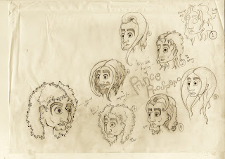
Ye Olde Prospero

Here is an image that I had scanned in about a thousand years ago, it was just some face experiments for what was going to be my main character for my negotiated project. Since doing these, however, i have decided to scrap the idea of Prince Prospero being a man, and he is now a small boy. I will scan in the new character designs asap, but just thought i'd upload this picture as an example of character development.
Also please excuse their vacant expressions, it was more of a hair/nose/chin development process.


Friday, 23 March 2012

Socks, anyone?


Here is the result of a rather quick doodle becoming a pattern design for a sock!
Never tried to make a continuous pattern before, so this was an interesting education :P
I found there was something oddly appealing about eyes being at the bottom of your body as well as (obviously) the top.
Enjoy :)

[EDIT] Woah there! Almost gave you all my details for a second! I've now pixelated them, you sneaky fiends.

Friday, 2 March 2012

updates


Here's some stuff i've been doing lately. This work is for a competition held by TigerPrint, a company that mainly designs for Marks & Spencers!
The brief was to create an image under the title 'She's all that... And more!', celebrating friendship and female relatives for anything! Be it birthdays or any other occassion.
i chose to keep my design suitable for any occassion, rather than target it for birthdays, and the caption 'You're the Cherry on top!' is cute and original :)
Enjoy!

ooh, and ill post up some sketches and ongoing work from my negotiated project soon :)
ttfn x

Saturday, 21 January 2012

Competitions!

Recently i've been working on a competition brief set by Secret7 of the Talenthouse website. the brief was to create ideas for vinyl covers for selected songs.
Below is my entry for Florence + the Machine's song 'Only if for the Night'
If you'd like to vote for me to be in the top 50, visit here; http://www.talenthouse.com/creativeinvites/preview/a7dcde13326593a19b34a790b803bd9b/383


Below is my entry for Ben Howard's song 'Black Flies'
Again, if you'd like to vote for me, visit here; http://www.talenthouse.com/creativeinvites/preview/a7dcde13326593a19b34a790b803bd9b/376

Page one in Sam Book

Development of page one in Sam book...
Sketch

Paint

I changed the face so that it didn't look as terrifying

Final double page spread

Sam!

The creation and evolution of my character, Sam.
Sketch
Paint
Photoshop finer lines
Adjusted colours

Updates on Editorials

Here are some updates on my work so far...

(above) this is my adjusted final illustration for the How To... Undo Things article. I've changes the position of the dandelion as well as the colours and typography to make it all a bit clearer than my original concept.
I have since adjusted the colours on the image below to make this new version (above). I think you can see it more clearly this way as the first version was a bit unreadable.

Monday, 7 November 2011

How to be Conceited


Above is my illustration for 'How to be Conceited', an article written by Guy Browning.
I really, honestly, do not like it. So i will definitely take time to re-work it and make it more visually pleasing overall.

Enjoy for now!
Comments will be gladly appreciated.
-Soph xx

Monday, 24 October 2011

For lovers of colour and Spam


Here it is!
All colourful and crazy!
Sorry for the HUGE file, the size of this image is massive for some reason and i don't know how to change that :S
It's to scale though, so yay :)
I get feedback on this work tomorrow, so keep an eye out for further changes + improvements as i'm sure i'll get many suggestions on that front in the A.M.
For now.....
SPAM!!!
- Soph xx

Friday, 21 October 2011

rough as...


We were set a little side project to accompany our on-going Spam work, in which we had to create a piece of editorial illustration to suit a particular article. From reading through the article it's main issue is addressing the theory that lots of little wins are better than one massive accomplishment.
this (very) rough idea of mine comes from the phrase 'its not the winning that counts, its the taking part'. so therefore it features a runner finding a sense of accomplishment in just starting the race at all.
I think it's a bit too obvious, and a little predictable, but nonetheless I want some feedback on it anyway :)
Maybe i'll do another one in the future, we'll see!
- Soph xx

Thursday, 20 October 2011

SPace hAM

I've been working on an advertising project lately, one that wants Spam to look modern and appealing to the newer generations. Specifically being the 'meal of the future'! It's been a lot of fun designing the characters, as the advert has to feature a spaceman, an alien, and a robot!
Here is my original draft of all three characters:


So then i had to arrange them into the permitted 200mmx200mm space, therefore after a long session of jiggery-pokery they've ended up like this:

It is still a work in progress, and I am currently in the process of painting the final image. Some of the features have change as to accommodate the central image of a tin of spam, but I'm happy with the outcome so far.
Will keep you updated!
- Soph x


Monday, 10 October 2011

Final Piece (..to be tweaked)


O.k. So here's my final piece for the project 'cocktail party', in which we had to combine all of our characters (see below) into one image, including an illustration of ourselves. This is what I came up with, and I must apologise for the horrible photograph, I will try and get a better image soon. All the elements are raised at different heights to give some interesting shadow, and all my characters are in champagne bubbles!
Done using acrylic paint, Photoshop and spray paint.
I will return to this piece in the future to tweak its appearance, such as the lack of background.
Enjoy for now!
- Soph x

Thursday, 6 October 2011

C'est moi!

I've been working on portraying myself as a character over the last couple of days, and this is how its turned out so far. As much as there are some needed changes (angle of the bottle, colour of clothes, etc.) I'm pretty pleased with it.
Done using acrylic paint.

7 Characters - Summer project


Fashion character inspired by the work of Hannah Davies


Fashion character inspired by the work of Nuno Dacosta


Character inspired by the work of Amy Sol


Character inspired by the work of Ruby Gatta

Character inspired by the work of Jim Flora


Fashion character inspired by the work of Banksy


Character inspired by the work of Angelique Houtkamp